

A Very O’Keeffe Week
Deer friends,
This week has been an especially exciting one regarding art and inspiration. Last week I got to visit the O’Keeffe-Moore exhibition at the San Diego Museum of Art just a couple days before it ended. I’ve always admired O’Keeffe’s work and life, and this was the largest collection I’ve seen of her work yet. Taking a deep dive into her work, both visually and through the writing that went along with it, I felt inspired to make this week’s artwork very O’Keeffe-esque. It was also my first time opening up my watercolor kit in over two years. It felt like discovering a new medium— exciting and inspiring. I’m excited to explore more work with watercolor in the coming weeks, and I’m even planning on bringing my travel kit along with me on an upcoming backpacking trip! The inspo roundup this week is also inspired by O’Keeffe and the connection between art and nature. And if you’re not tired of my gushing over O’Keeffe yet, the artist highlight will be a little recap of some of my favorite pieces from the exhibition.
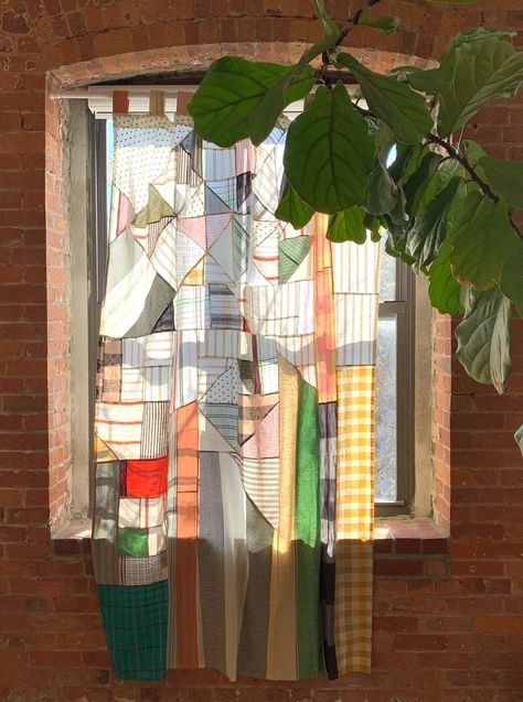
Here’s the latest print:

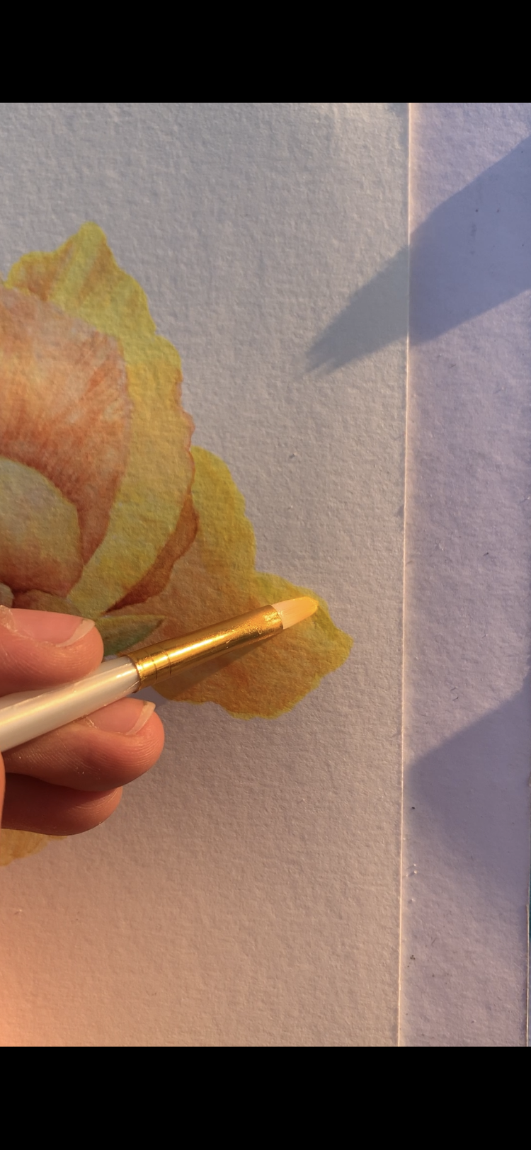
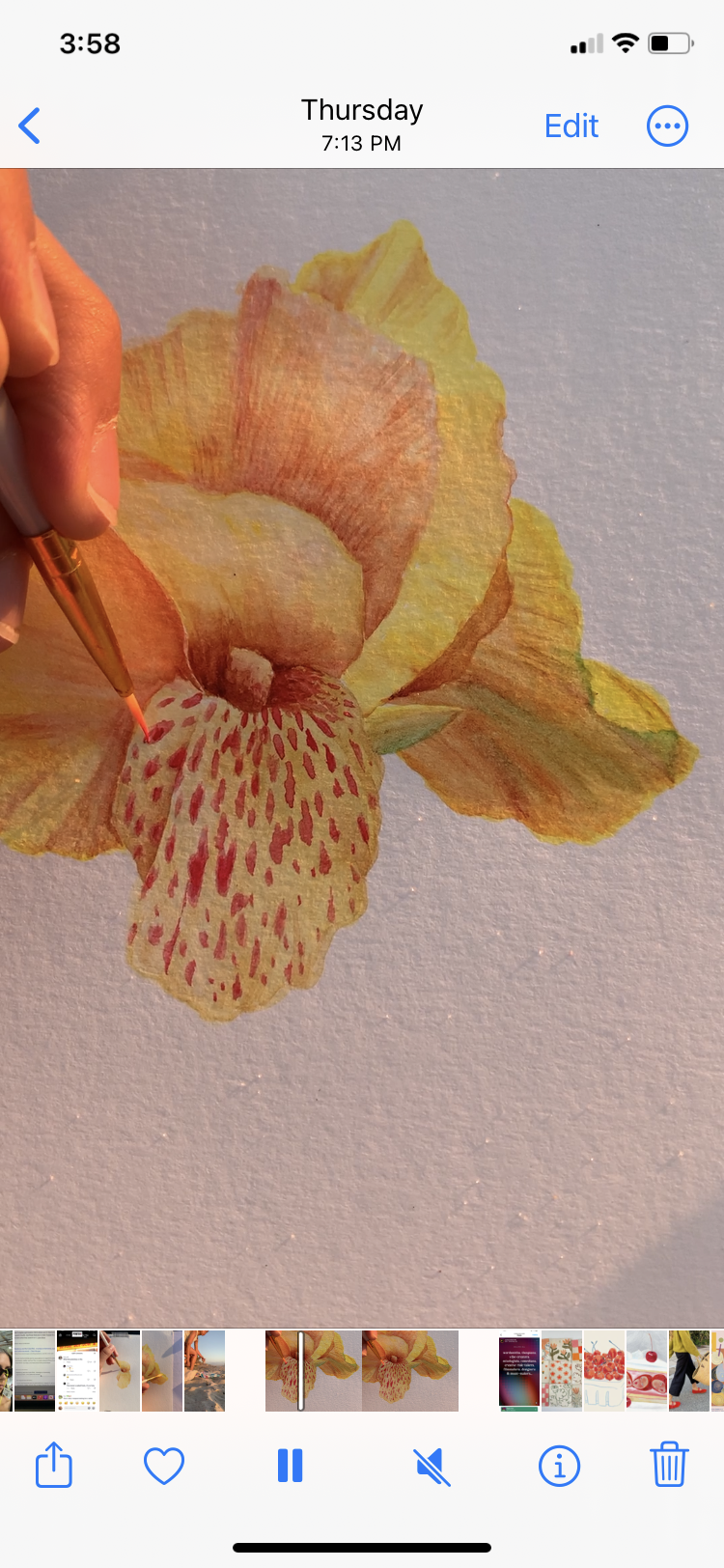
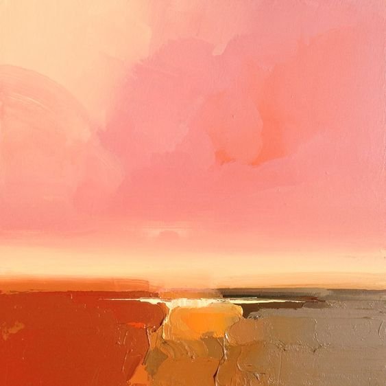
Chroma, Canna, Ox Coxae
watercolor on paper, 2023
This week I was heavily inspired by Georgia O’Keeffe (is that obvious yet?). I had actually started this piece the day before I went to her exhibition at SDMA, and I felt so moved to make something inspired by her work in anticipation of seeing her show.
I’ve always been particularly inspired by her attentiveness to nature and her unique perspective when it came to drawing or painting these natural elements around her. So I packed my watercolor kit and a towel into my tote bag and walked down to the beach in the evening.
For a couple days in a row I painted on the beach while the sun set, and not to sound cliche, but painting in nature is just SO much better than painting indoors. It’s definitely something I want to do more often. I felt so much more inspired just being outdoors in a place that I loved. And it was my first time using watercolors in about two years, which also felt exciting in a way. You can expect a lot more watercolor work form me in the future.
This piece is obviously inspired by O’Keeffe’s flower and bone paintings, as well as her use of vibrant colors. I painted a spotted Canna Lily that I saw in my neighbor’s garden, and then a part of a pelvic bone (os coxae in Latin) to keep in true O’Keeffe fashion. I didn’t bother with a pencil sketch and just went for it with the water color paints, and I’m really happy with how it came out! This piece is available with two different paper options and four different sizes, and I recommend framing it in a larger frame with wide matting for a really elevated look. You can purchase the print here.


On to the next…
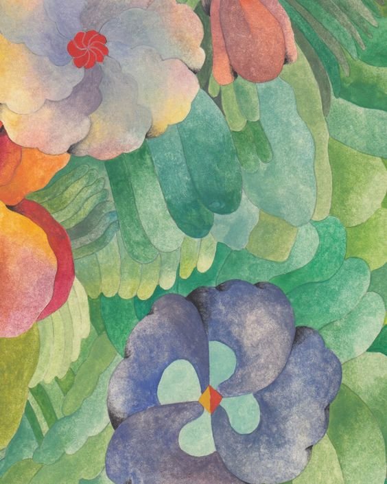
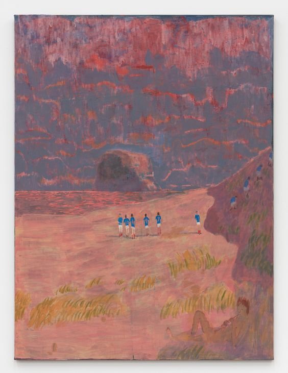
Inspired by the colors, loose gestures, and deep connection to nature that O’Keeffe explores in her work, this week’s inspo roundup is full of rich paintings, plants, and artists not afraid to explore with bold colors and abstract forms. From the work of A H Weber, whose surreal and pastel paintings boast the influence of folk art and the beauty and variety of plants and flowers, to vintage collages, to O’Keeffe herself, this batch was a beautiful one to curate. Seeing art from all different types of medium use color so liberally and boldly makes me want to throw out every beige thing I own— clothes, paints, you name it. Knowing how to use color effectively is a skill that I struggle with in my own work. I know the colors that I like in other people’s art, and I can picture the colors I want to work with in my own, but as soon as it’s time to put brush or pen to paper, the colors slip away. I think really the only way to improve at that is just to use a LOT of color. To let go of the perfectionist tendencies to keep colors within a limited palette or stick to neutrals. I think with anything creative you just have to experiment until you find the thing that works. So strap in for a whole lot of color ahead.
This week’s inspo:


This week I’m highlighting:
A Recap of the O’Keeffe exhibition at SDMA
Last week I visited the SDMA to see the O'Keeffe-Moore exhibition for its closing weekend. The exhibition intertwined the creative visions of Georgia O’Keeffe and Henry Moore, two artists exploring similar themes in their art around the same time— O’Keeffe in the desert of New Mexico and Moore in Castleford, England. While O’Keeffe’s work centered around her oil and pastel work depicting desert landscapes, flowers, bones, and exploring themes of surrealism, Moore’s work featured sculptures in bronze and stone, along with his paintings. For the sake of keeping this newsletter short I’ll really only be reflecting on the O’Keeffe portion of the show, but I highly recommend looking into Moore’s work.

Color, form, and the meaning of it all
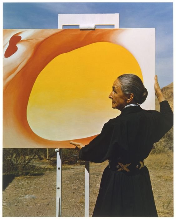
Pedernal— From the Ranch #1 was one of my favorite pieces from the show. Oil on canvas, O’Keeffe painted the view of the mesa through the “lens” of a sun-bleached pelvic bone. The edges of the loose circle appear smooth and soft even, starkly different from what one thinks of when considering the form and texture of bones.
At the end of the exhibition there was a short video interview played against a screen where O’Keeffe said that it never occurred to her to think of death when considering the bones she painted. She just thought they were beautiful and wanted other people to see their beauty the same way she saw it. I loved that.
I think sometimes we’re so quick to jump to conclusions regarding symbolism and meaning in art. The construct that things must be named, understood, assigned meaning. But some things, particularly within art, just are. It doesn’t have to mean something greater. It can, surely, I mean I personally love dissecting the meaning behind others work as well as my own, but I also think there’s beauty in some things remaining a mystery.
So I’m sure this piece has been picked to the bone (no pun intended) for all the hidden meaning behind it, but I like that, to me, this one’s a bit of a mystery. I know that the glowing red, pale blue, and amorphous shapes are an ode to the landscape that O’Keeffe fell in love with in New Mexico, but it’s also just a beautiful play between color and form. And I love it for all these reasons.


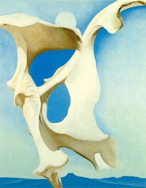
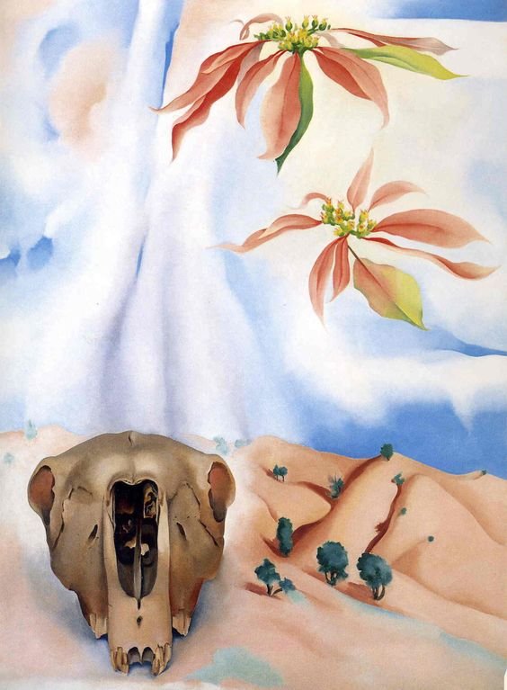
So surreal
Mules Skull with Pink Poinsettias was another piece that I was particularly drawn to at the show. O’Keeffe explored surrealism in a lot of her work, sometimes more subtly than others, but I liked how bold this piece was. The hugely disproportionate scale of the skull to the landscape, the floating flowers in the sky, and the wispy clouds that feel more reminiscent of her close-up flower paintings than of a sky.
Keeping with a similar color palette to Pedernal— From the Ranch #1, I was also drawn to how the warm pinks played with the cooler toned blues, and how the piece has a very pastel color palette without feeling washed out. I also always love a good funky flower with the tendril-like petals of the poinsettias here.

Intentionality
Part of the exhibition included a recreation of O’Keeffe’s studio space at her Ghost Ranch home in New Mexico. Something that I hadn’t known about her work prior to this, is that she actually made her own pastels. She also kept a different paint brush for each color when working with oil paints, and she never mixed paints on the canvas.
This all spoke to the intentionality of her work, beyond the content, symbolism, or deeper meaning. The planning and forethought that went into her art makes me want to take a step back and slow down when it comes to actually creating. I tend to rush things, or if I’m feeling particularly perfectionistic I just won’t even finish something if I can’t make it perfect. Seeing O’Keeffe’s space and learning the way she worked makes me want to work with more intentionality.
It makes me want to live with more intentionality, too.


Perspective
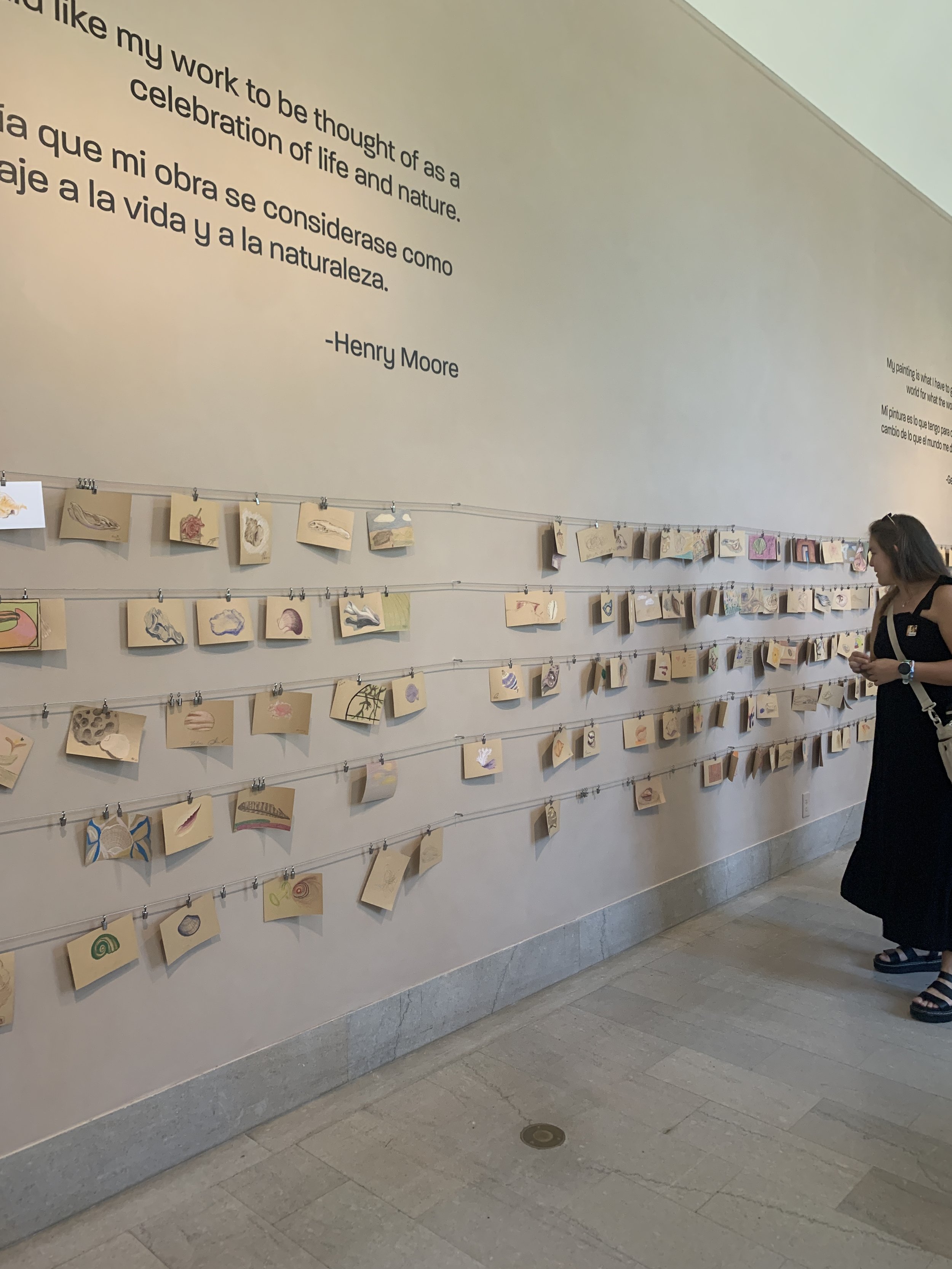
At the very end of the exhibition there were tables covered with shells, bones, driftwood, and feathers, along with postcard-sized paper and colored pencils.
The idea was to find an element that spoke to you and draw it, using inspiration gathered from O’Keeffe’s art to view the bones and shells with a new perspective. Really looking at the elements and drawing them how we really saw them, and not just how we think about these objects looking.
For example, if I asked you to picture a shell in your head right now it’s probably from a perspective where you can perfectly see all the edges, it might be symmetrical, and I’m guessing it’s pretty smooth and uniform in color. But if you’re actually looking at a shell you’re more focused on the finer details. The ridges and bumps, the subtle change in color from the smooth inner shell to the rougher, sun-bleached outer shell. It’s like a completely different object. A different kind of beauty. I think it’s nice to look at ourselves like that every once in a while.
We spent a couple minutes drawing an object, and then hung them up on the wall with everyone else’s. Seeing all the drawings of shells, bones, and other natural elements all lined up together on the wall, you were able to see and appreciate how each person saw these objects differently when we all took a second to really see them. It was kind of a beautiful reflection of the way we go about our lives, with different perspectives formed from different experiences, cultures, values, and interests.


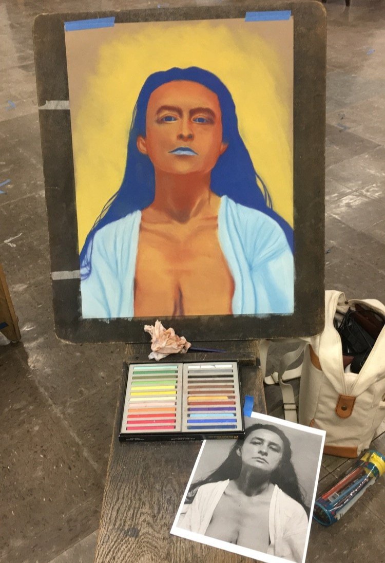
Thanks for reading my love letter to Georgia O’Keeffe. She truly is one of my biggest artistic inspirations and seeing this much of her art all together in one show was truly incredible. A huge thank you to Liz Shopes for taking me along with her to the show. It made me realize how long it’s been since I’ve been able to frequent art museums and I’m so excited to explore more of galleries and museums here in Southern California. I’ll leave you with a pastel portrait I made of Georgia O’Keeffe back in 2019 or 2020 where we were only allowed to use 2 colors for the portrait (hence the blue hair and lips haha).
Until next week,
Morgan